We thought it would be interesting to show you something we generate every now and again…
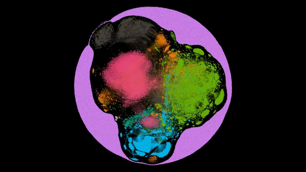
That is our representation of the SOS Intelligence Dark Web Index, the physical placement of the nodes represents the interconnectivity between onion services on the Dark Web (Tor).
It is an energy model of the network structure of the Dark Web.
The diagram is a visual representation of an energy model of the network structure for interconnecting onion services
Essentially, If a node has a lot of links, it has a heavier weight applied to it.
If a node has fewer links, it has a lighter weight applied to it and has less weight represented. The more links, the more central we represent that node on the map. Therefore onion services with fewer inbound or outbound links get ‘pushed’ outward to the edges of the map. Onions with more links weigh more so are positioned more centrally.
The colour is a computed modularity class – the social network of the nodes. We have calculated the community networks of the nodes. i.e. how likely it is that a node is linked to other nodes within the network.
What we get is a spatial representation and social network of around 43000 nodes in the past 24 hours.
The colour itself is random, but the membership of the colour is representative of their social network. What we don’t mean is their Facebook membership, but rather their community connections within the Dark Web.
The visualisation is stunning when seen on a large screen so we have made this available to download here in 4K.

If you are feeling kind, a tweet or short blog post about this would be much appreciated 🙂

